

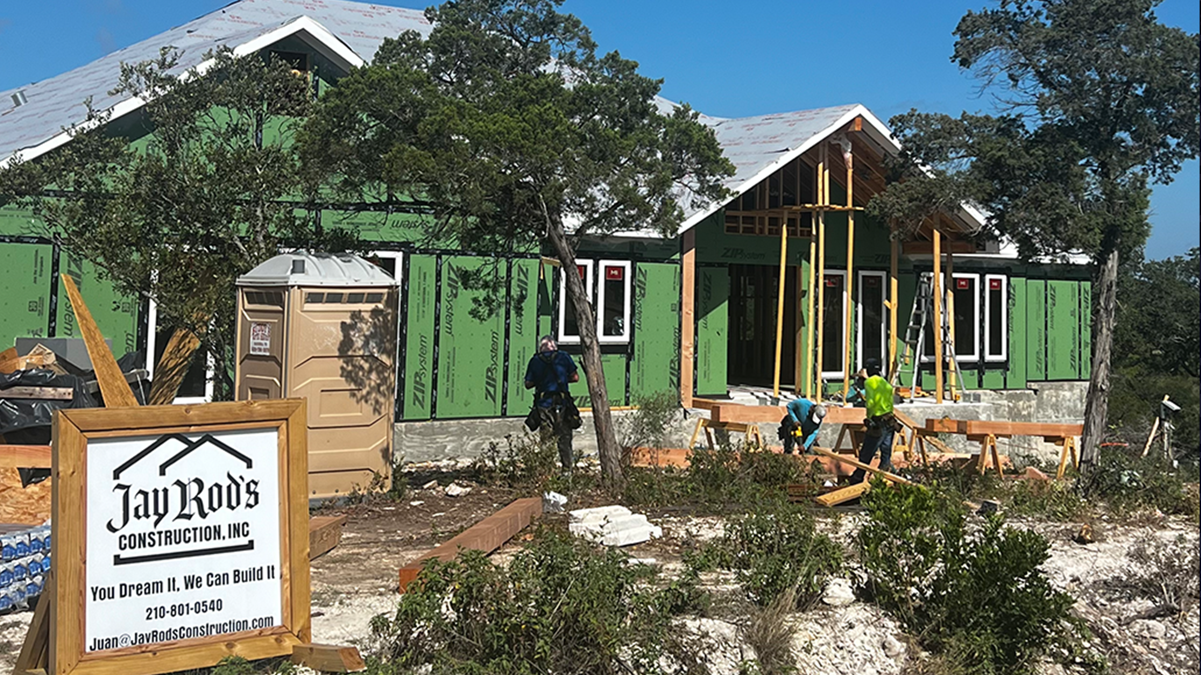
Jay Rod’s Construction, Inc
Logomark
Logomark
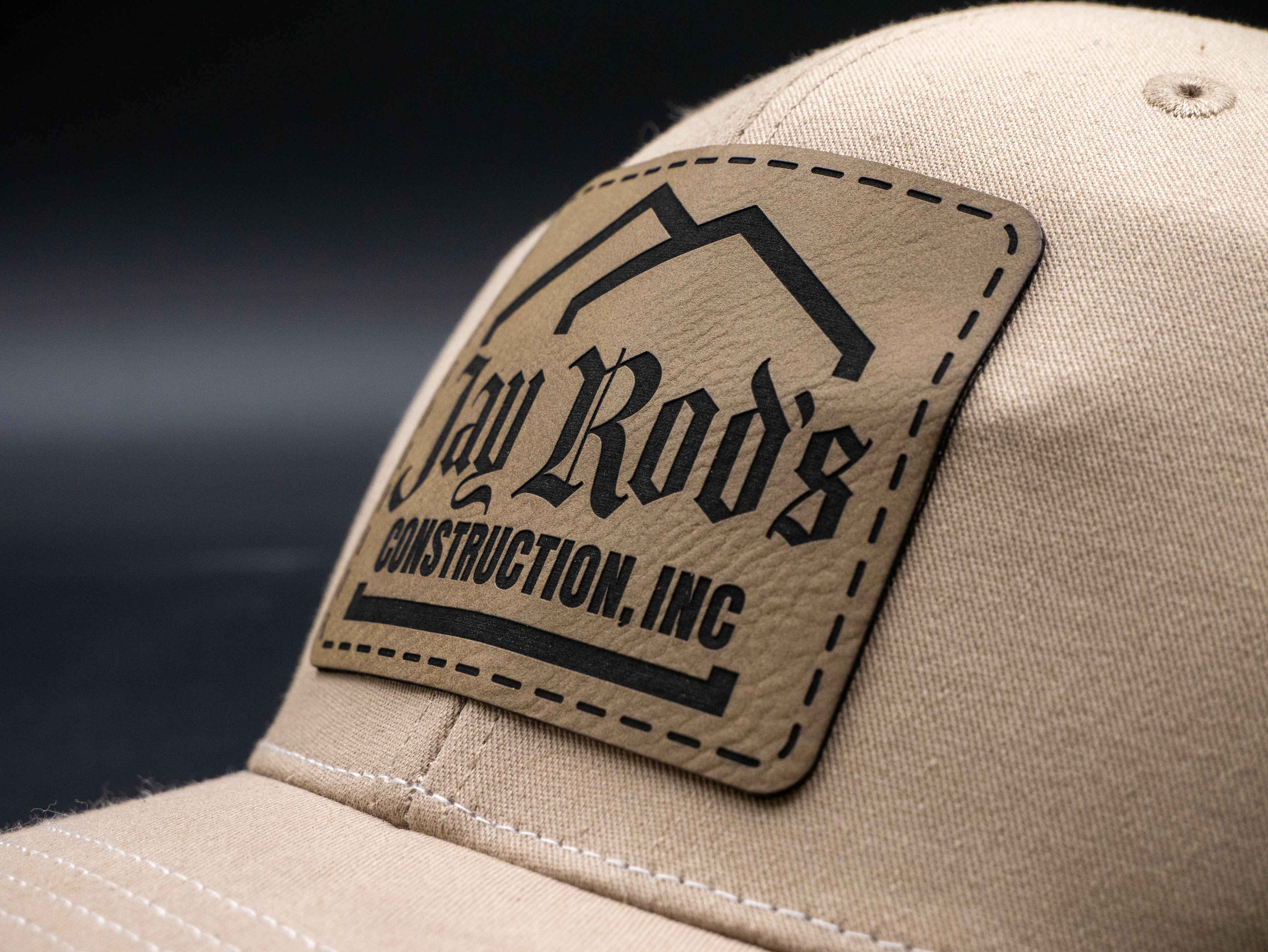
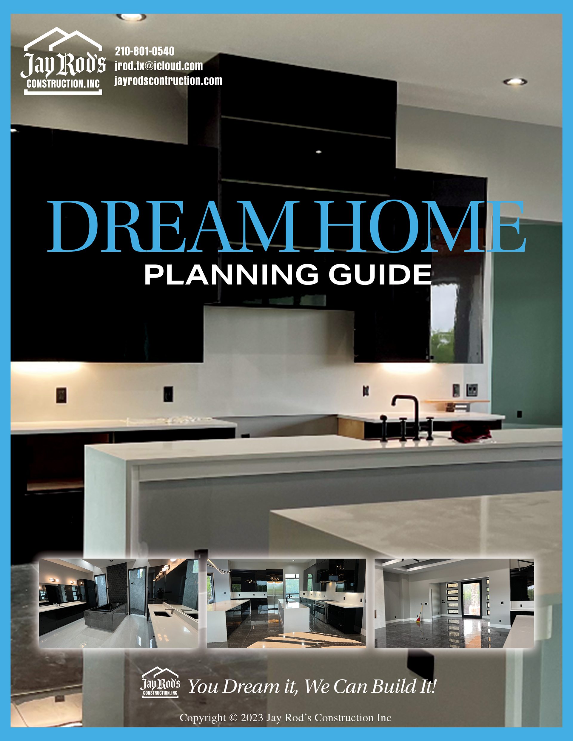
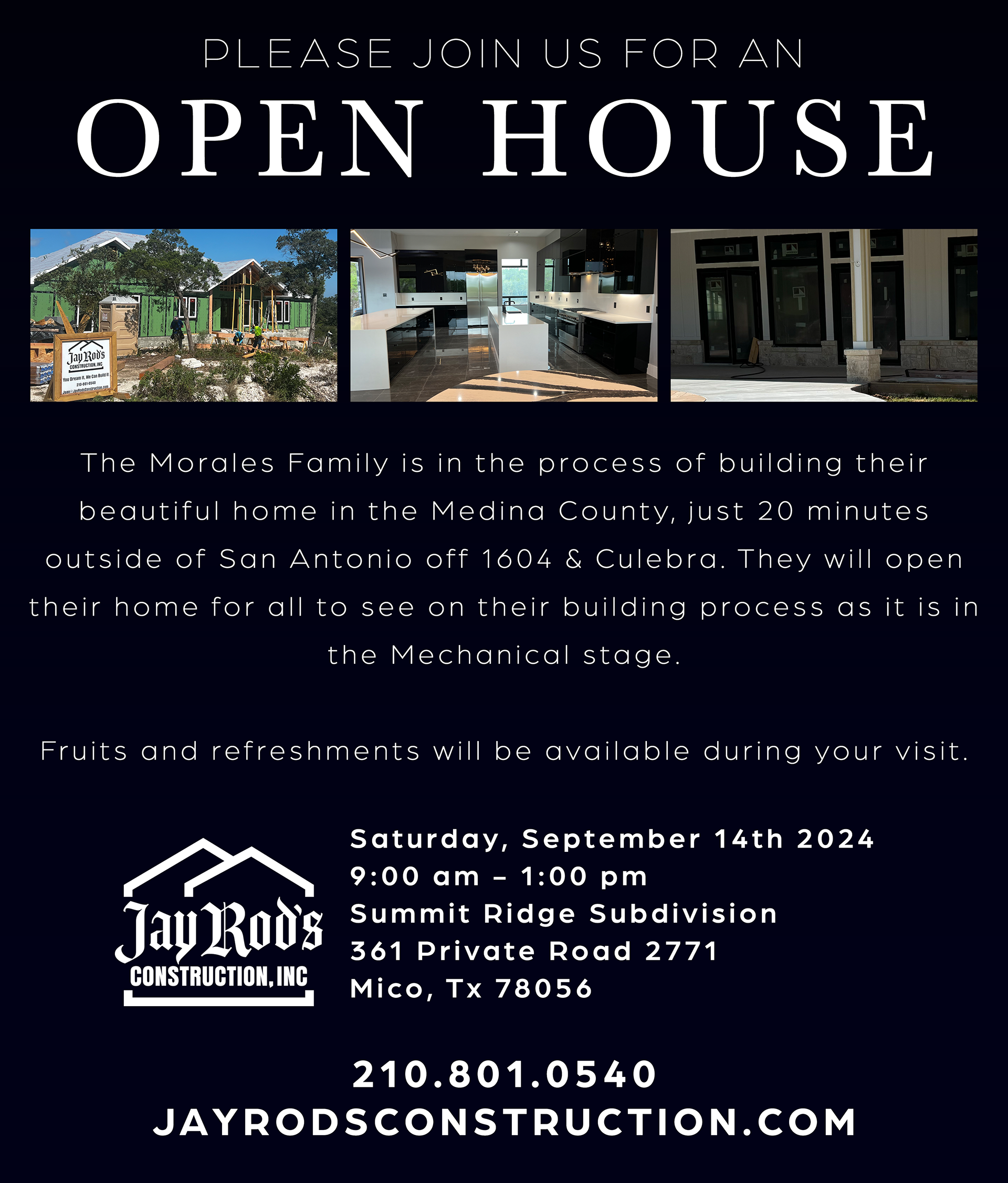
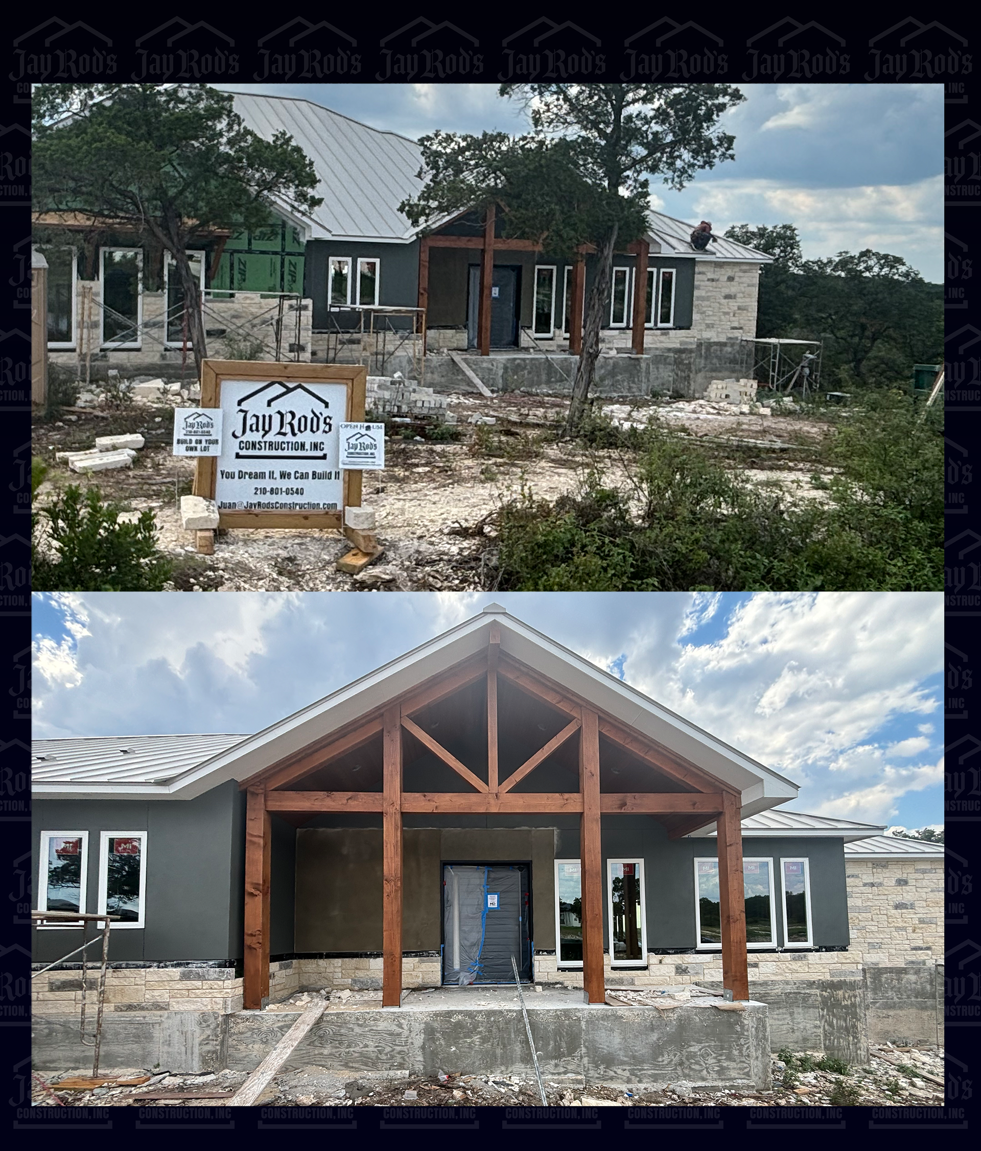
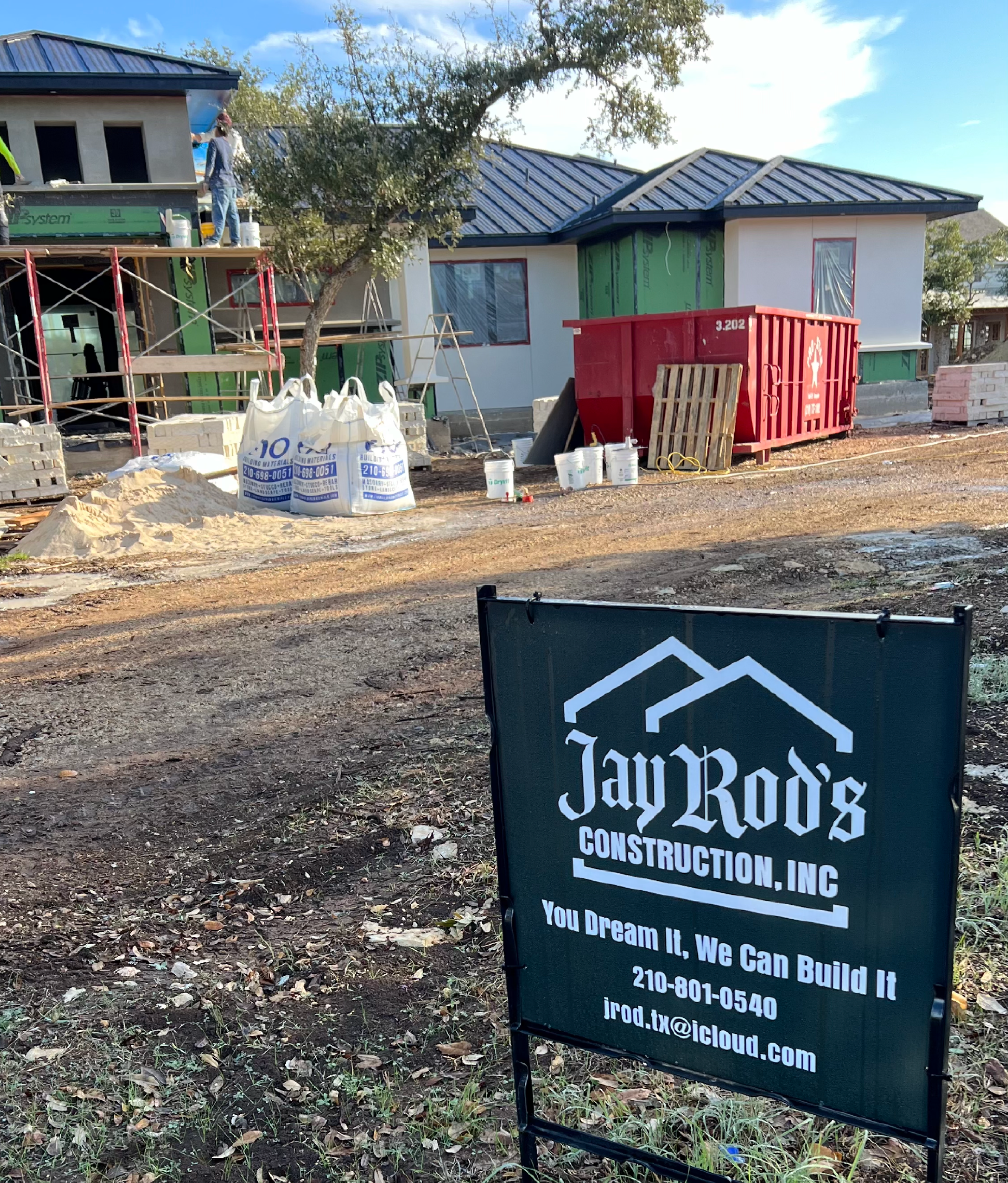
For Jay Rod's Construction, I designed a modern yet grounded identity to capture the strength, reliability, and craftsmanship at the core of Jay Rod’s Construction. The logomark was extended across signage, apparel, and assets such as business cards, paperwork, social media.
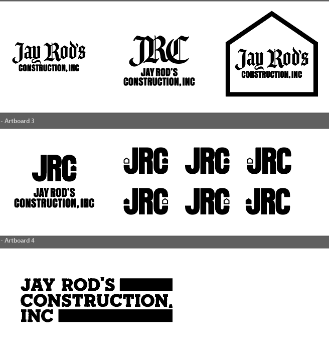
Initial Concept Exploration
The brief for this project required a balance between industry utility and personal identity. The client wanted a clean, grounded logo that felt established without being overly corporate or flashy. With an upcoming job site launch creating a strict deadline, we needed to move fast from ideation to final vector deliverables.
I began with exploring geometric monograms, industrial tool silhouettes, and structural architectural framing. Working under a compressed timeline, keeping the initial explorations high-contrast and monochrome allowed us to pressure-test readability at a distance—a must for hard hats, truck decals, and workwear.
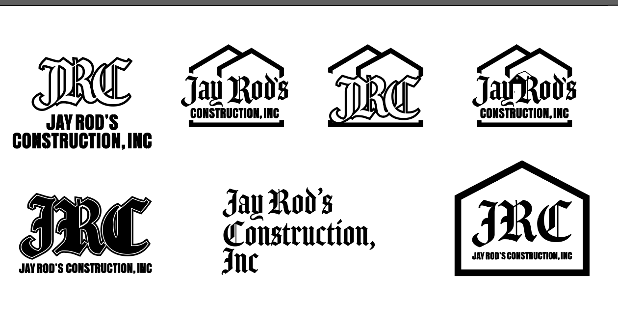
Final Marks and Print Collateral
Once the core mark was finalized, I refined the vector linework to guarantee crisp reproduction at any size. The system was then prepped for everyday use in the field—translating seamlessly onto company flyers, site signage, and custom embroidered hats for the crew


Bella Casa Custom Builders
Logomark
Logomark
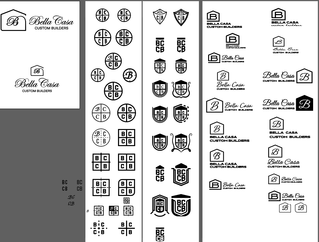
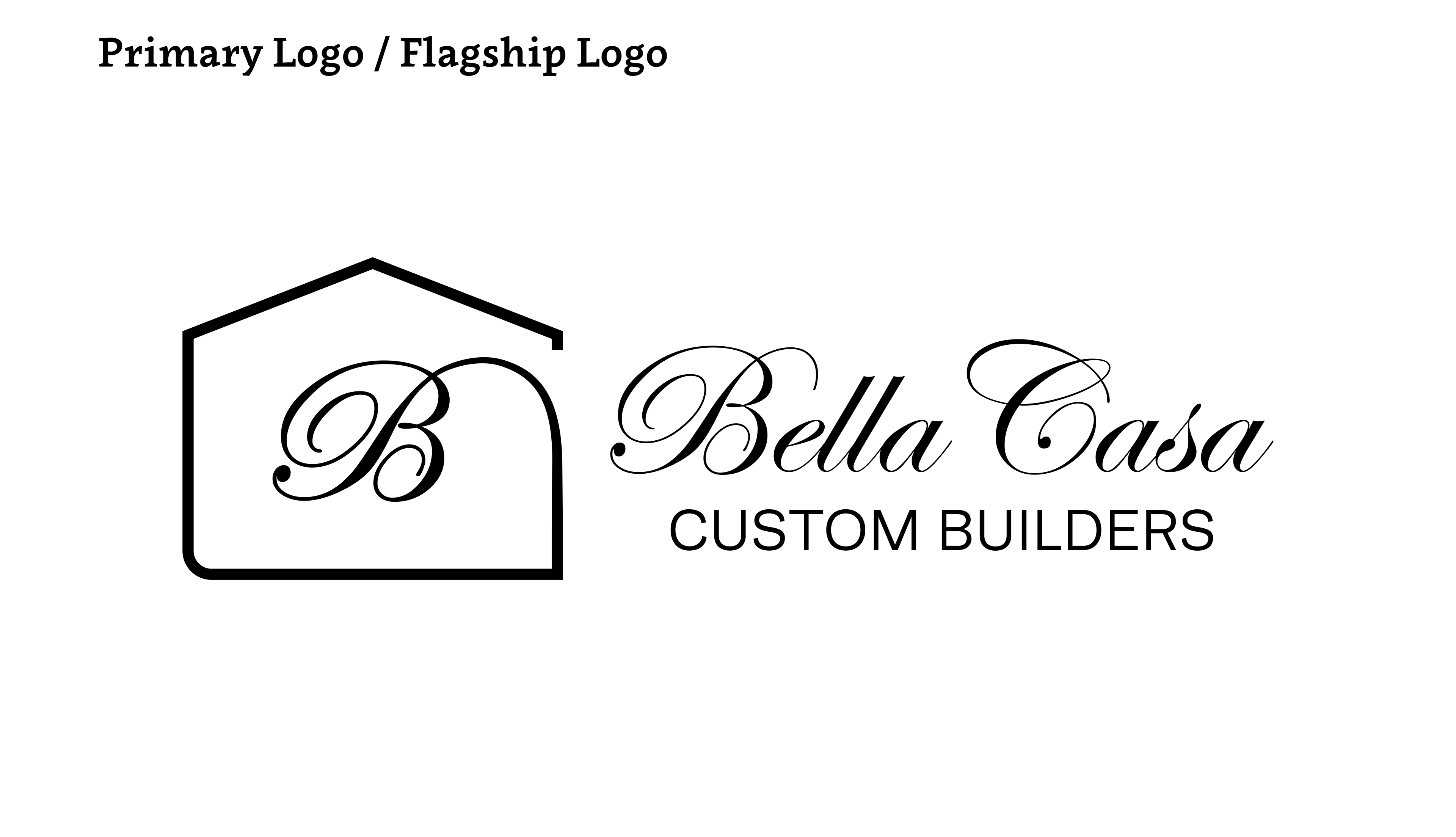
For Bella Casa Custom Builders, I designed a logo and matching monogram that reflect the company's focus on quality craftsmanship and luxury custom homes.



RB Custom Homes LLC
Logomark & Vectorizing
Logomark & Vectorizing
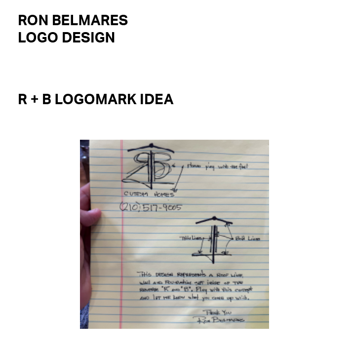
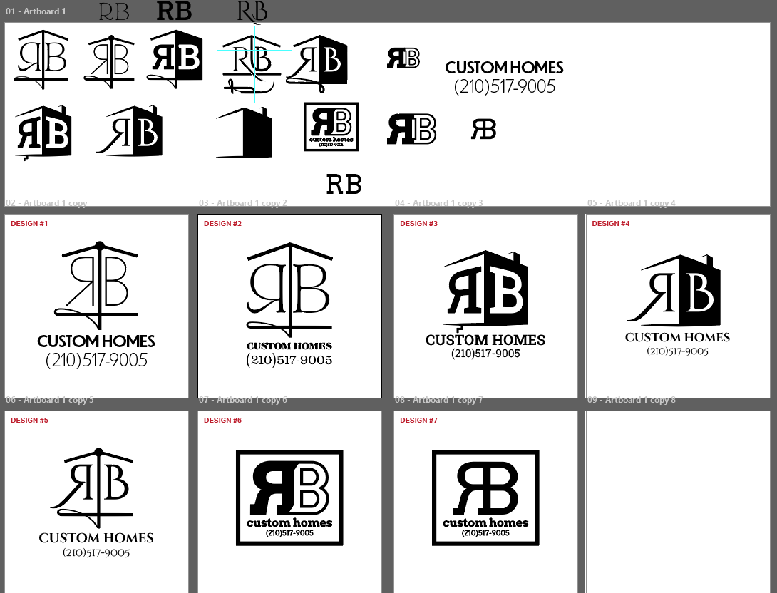
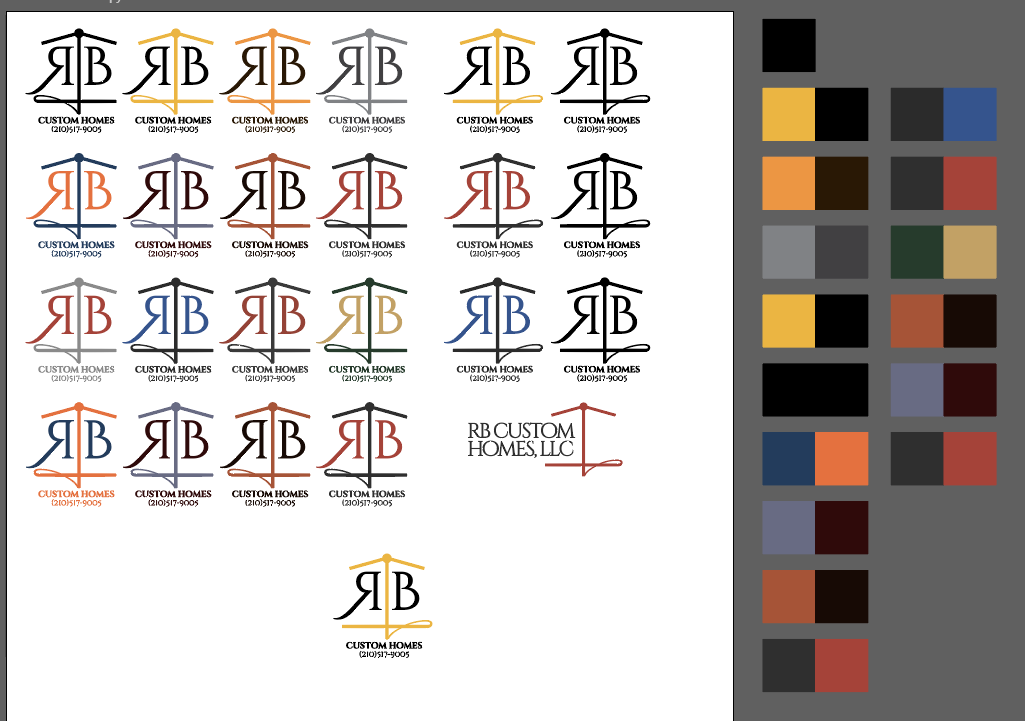
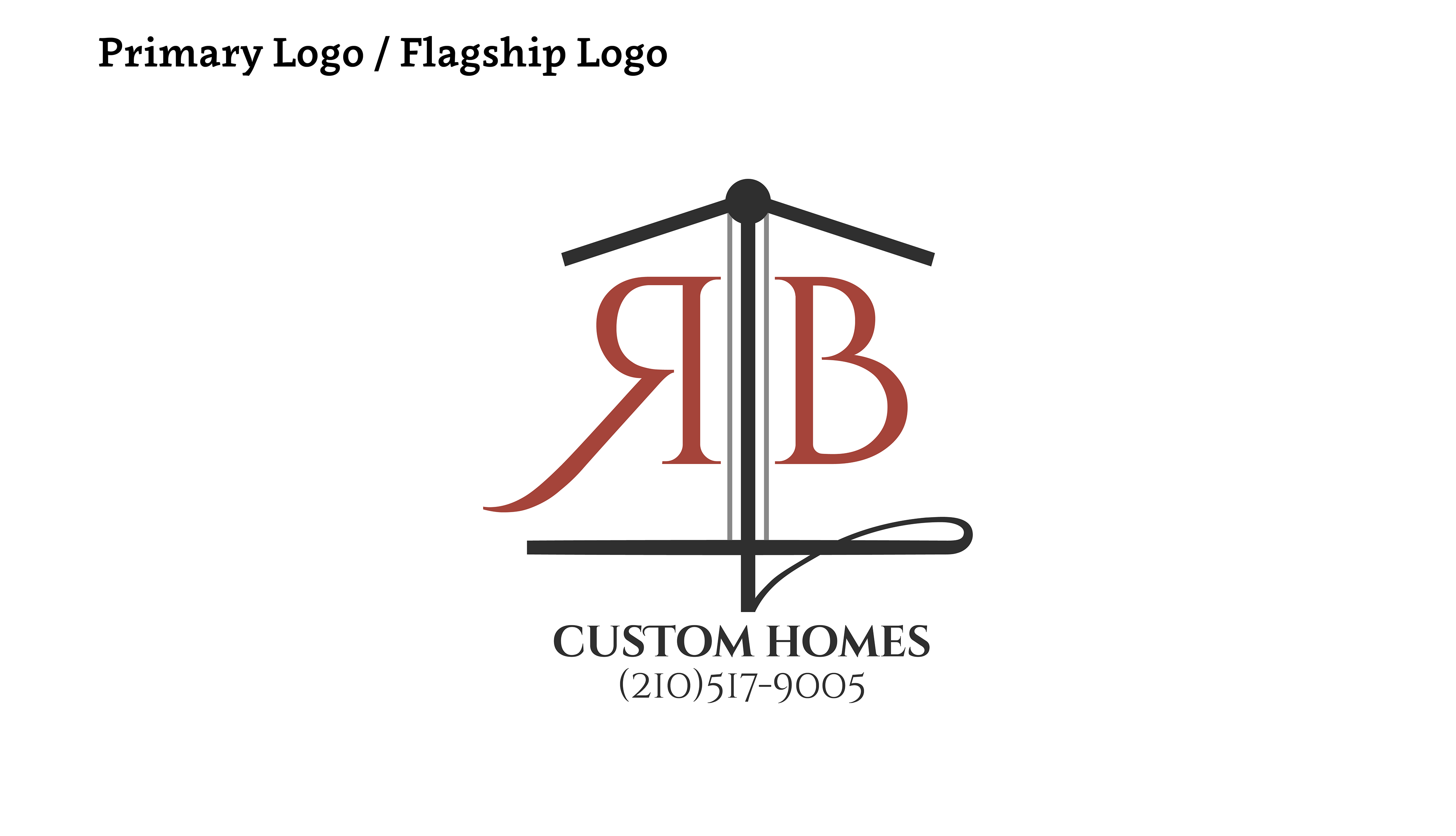
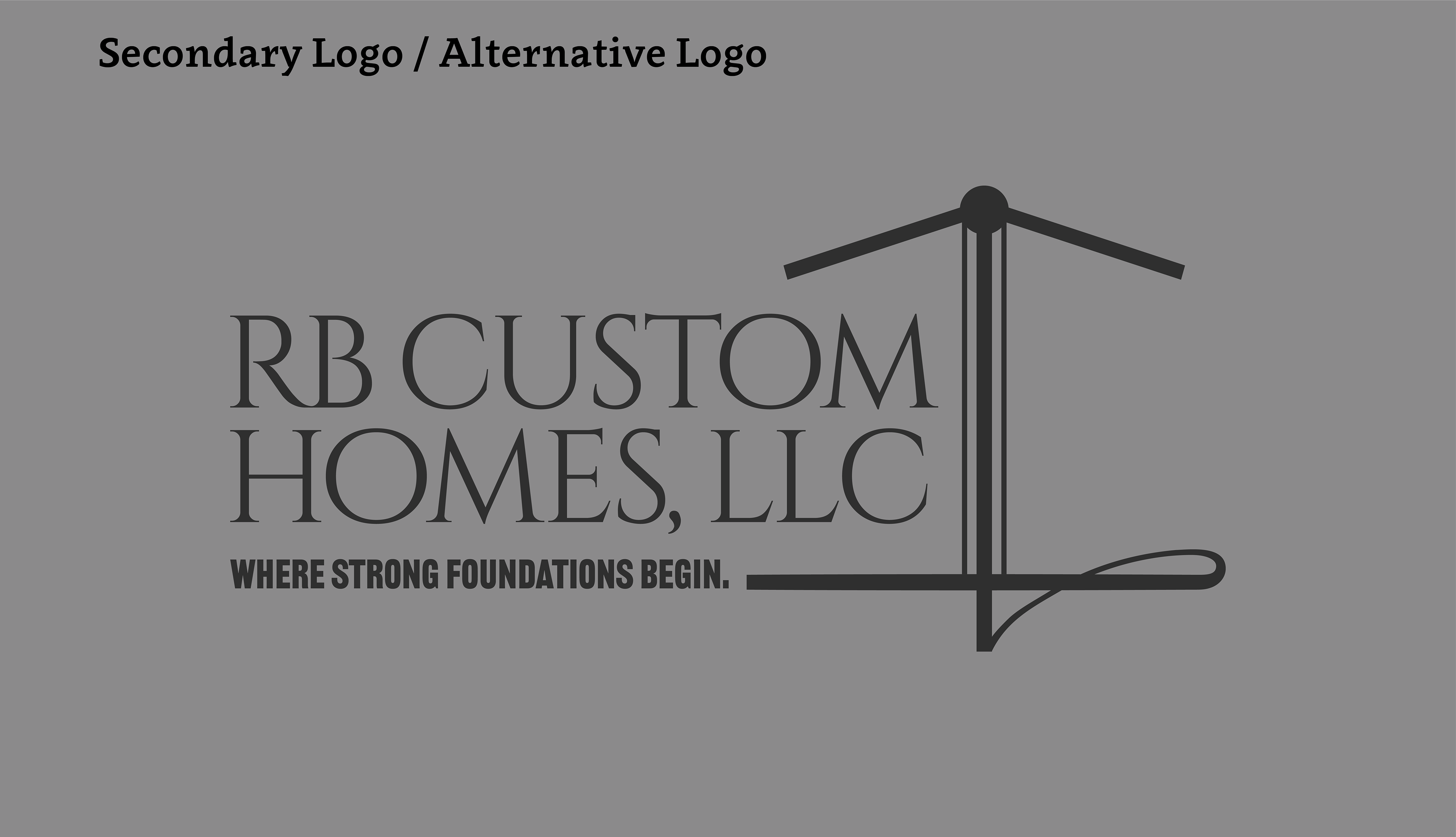
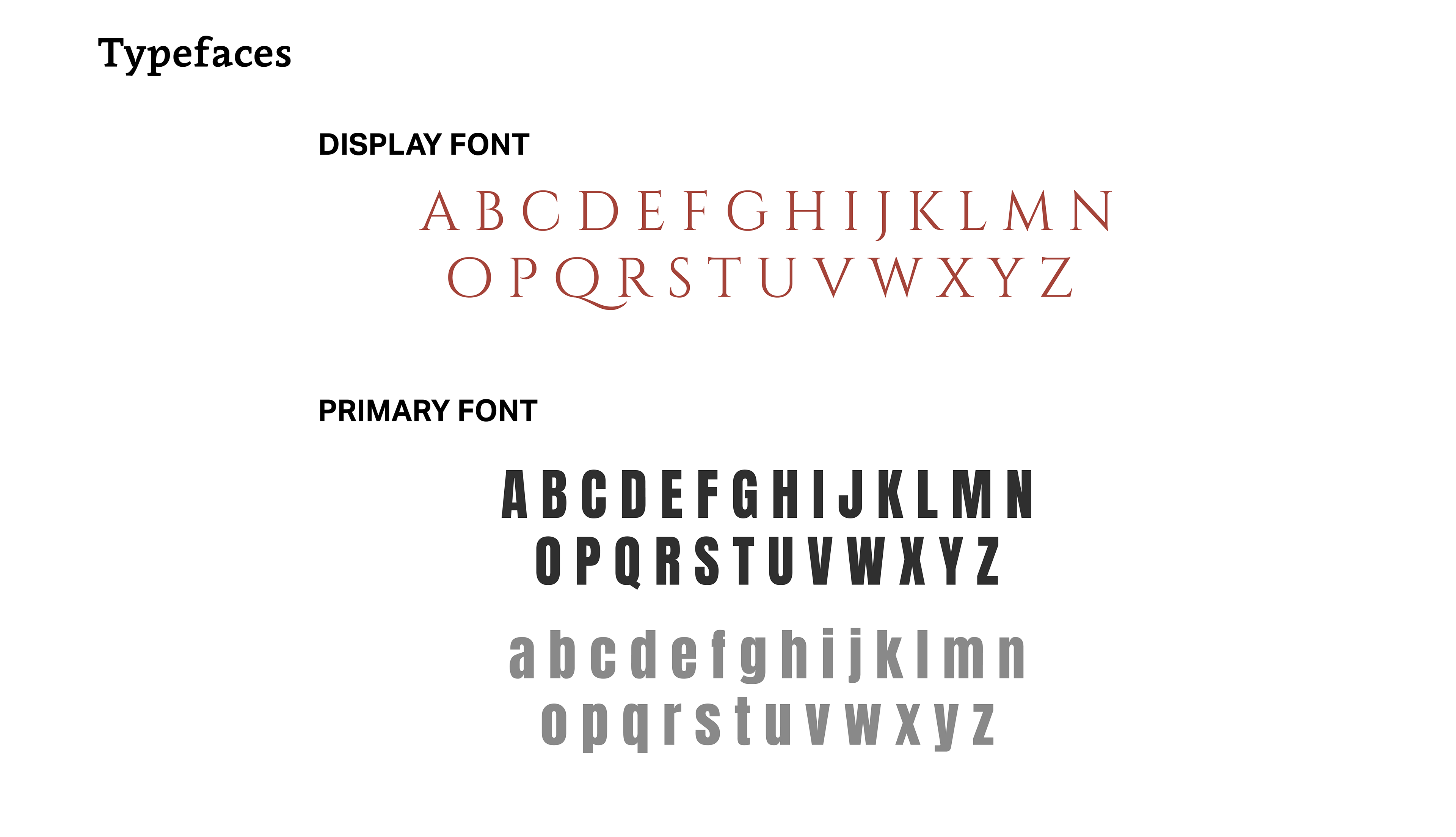
The client approached me with a clear vision for his company’s logo. After our initial consultation, it was evident he was fully committed to his original concept and simply needed an expert to bring it to life. I focused on accurately vectorizing his idea while establishing a cohesive color palette and typography system for his company.

Jane ATX Shoegaze Band
Jane, an Austin-based shoegaze band, brought me on to design custom stickers and merch graphics. I started with initial character sketches in Procreate before taking the assets into Adobe Illustrator for final vectorizing and print prep. The visual direction blends the band’s bulldog mascot with classic Latin and Chicano art motifs, featuring custom crying and laughing masks alongside hand-drawn typography.


Selected Directions
After reviewing initial explorations, Jane locked in these specific concepts. From there, I translated the hand-drawn sketches into precise vector artwork—tightening the anatomy, refining the custom lettering, and prepping the files for physical merch production.


From Vector to Production
Once the linework was locked in, I prepped the graphics across both apparel and physical promo. For the merch table, we dropped front and back hits across heavyweight black and white tees, pairing the character illustrations with custom typography. Alongside the shirts, we adapted the circular badge and mascot artwork into vibrant die-cut stickers for show handouts and fan promo.


